Red Dot Brand & Communication Design Awards of year 2021, 9 best packaging design awards announced!
2021-11-30 11:11:42
view:
The German Red Dot Award is founded by the Famous German Design Association, which enjoys a good reputation in the design industry.It is dedicated to selecting outstanding creative works from all over the world and from all walks of life. The awards are divided into three categories: Product Design, Brands & Communication Design, and Design Concept.
On November 11, the 2021 Red Dot Brand & Communication Design Awards announced the winners of this year. 188 works in the packaging category were awarded Red Dot, nine of which won the Best of the Best award. Milgrad,designed by Depot Branding Agency, also won the Grand Prix.
Let's enjoy these 9 “the Best of the Best” packaging designs.
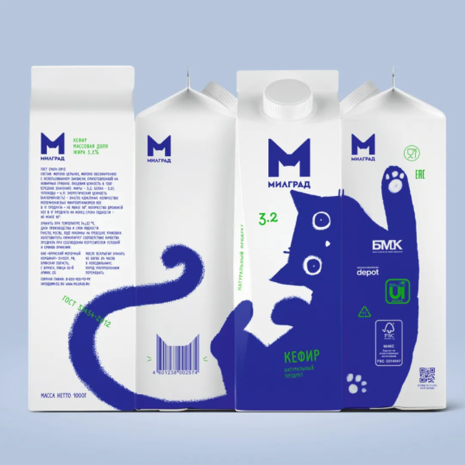
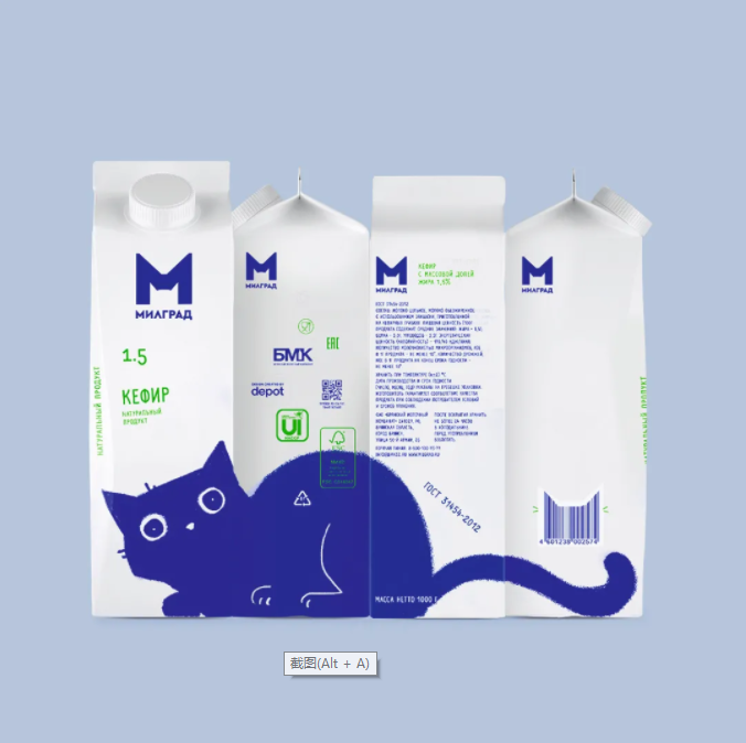
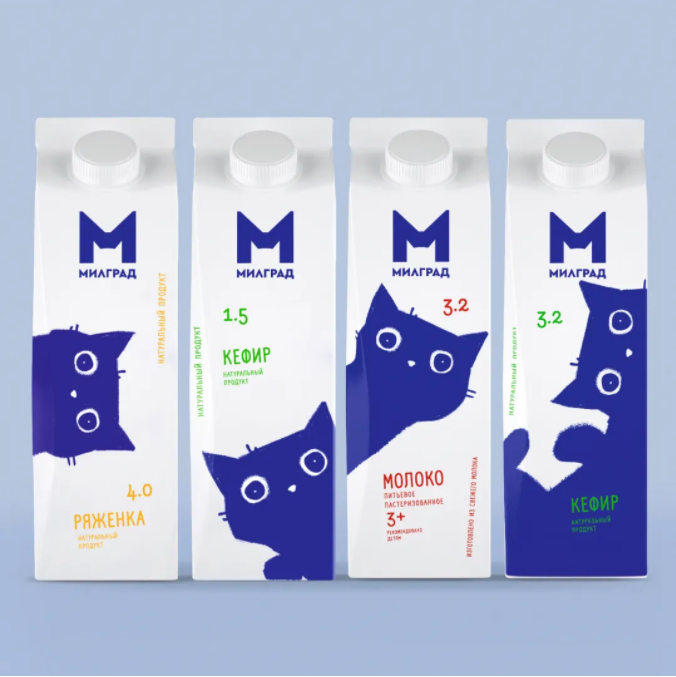
Client: Bryansk Dairy Plant OJSC, Bryansk, Russia Design: Depot branding agency, Moscow, Russia
Milgrad's distinctive packaging design perfectly shows cats with different postures interlacing between the packages. It is flexible and playful. The simple and eye-catching design can well attract consumers' attention and generate interaction with the packaging. Establish different scenes and win over consumers by playing with this design cleverly on the shelf.
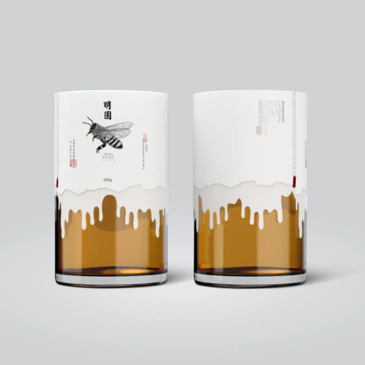
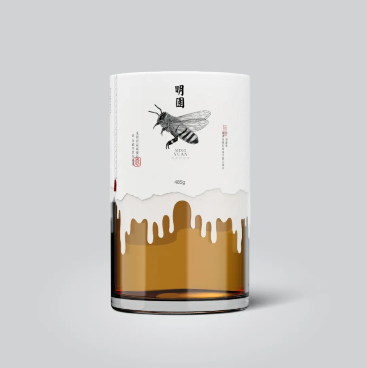
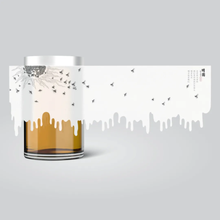
Ming Garden Honey
Client: HongKong Kyson Food Co., Ltd., Hong Kong Design: Shenzhen Zhiming Design Co., Ltd., Shenzhen, China
Ming Garden Honey expresses the process of honey production in the packaging, and conveys the intuitive sense of bees' hard work and high-quality products through the clever combination of bees' image and honey drops on the bottle packaging paper.
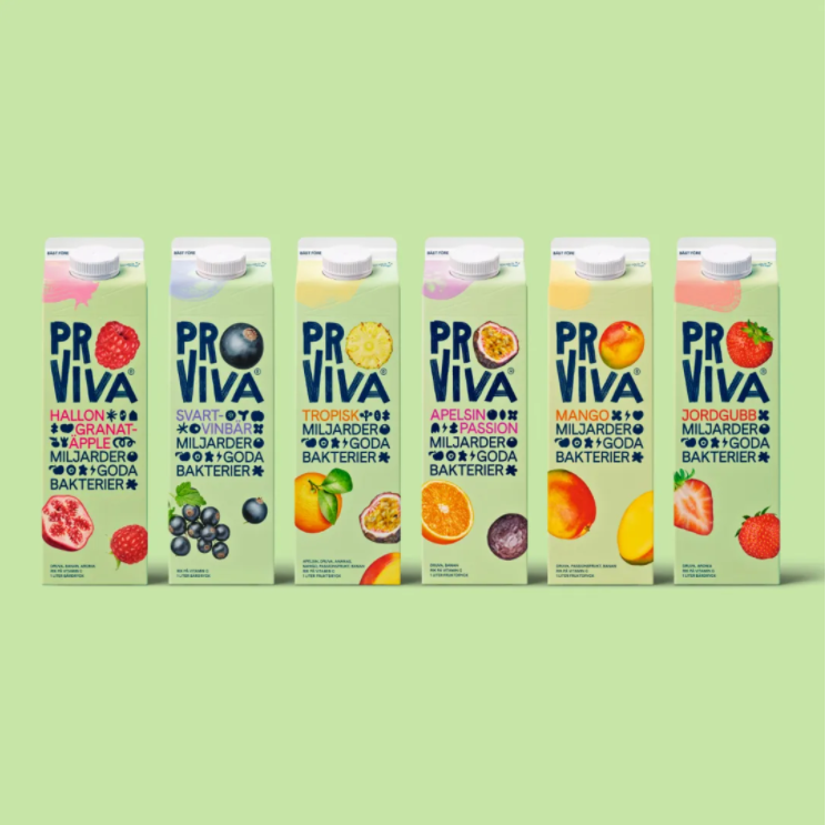
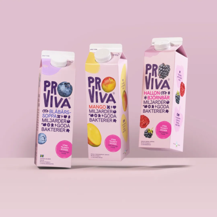
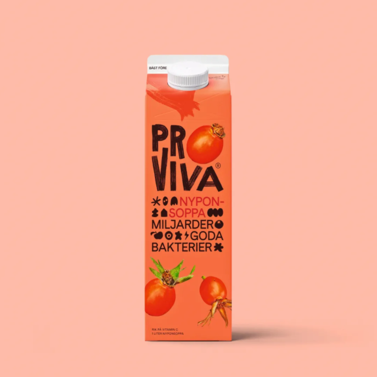
ProViva
Client: ProViva AB, Solna, Sweden Design: BVD, Stockholm, Sweden
ProViva is an important energy drink in Sweden. In order to attract younger consumers and better differentiate the packaging, the new packaging design combines intestinal health and different types of fruit in a relaxed and novel way. The beneficial bacteria contained in the juice come in the form of ICONS that are immediately understood by consumers, even without an explicit name.
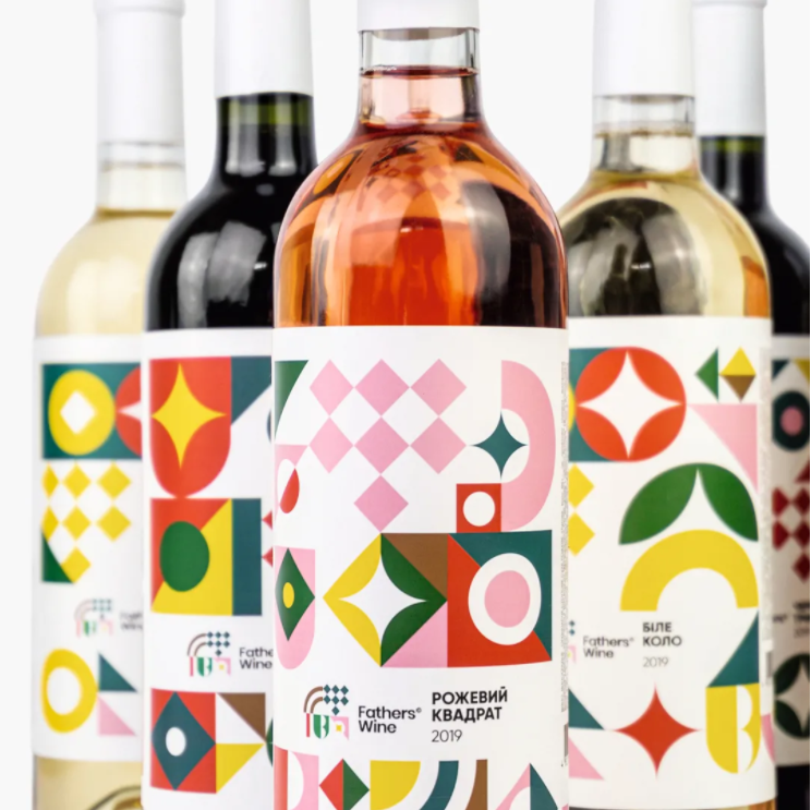
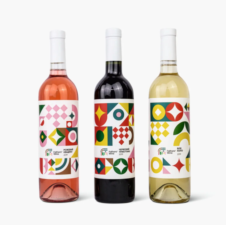
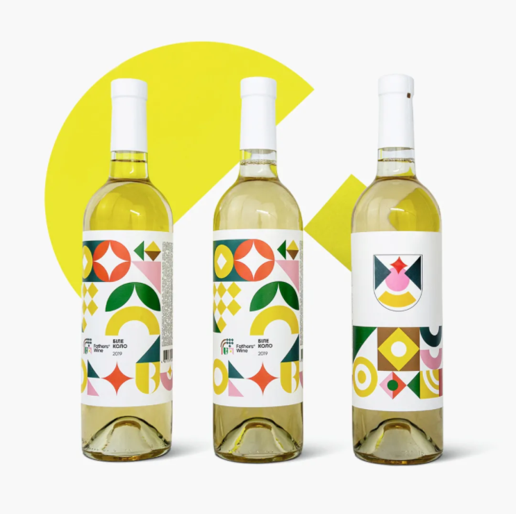
Fathers Wine. Coat of arms generator.
Client: Fathers Wine, Husiatyn, Ukraine Design: R Agency, Kyiv, Ukraine
Fathers Wine's new packaging design stands out first because it engages with buyers by creating a heraldic area on the back of the bottle, with a blank, simple geometric feel drawn from the traditional Ukrainian symbols, This novel approach neatly conveys the family business's message - to experience pleasure and a strong sense of togetherness while enjoying good wine.
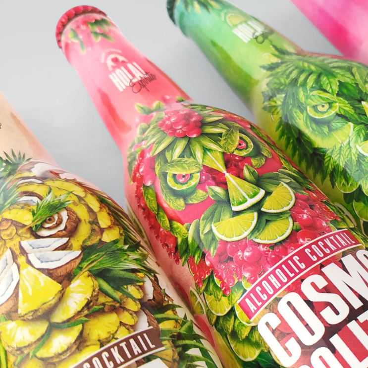
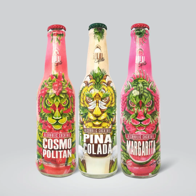
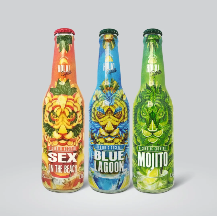
In order to attract more young consumers, Hola! Espirito's new signature cocktail brand image uses the Spanish greeting "Hola" in a straightforward way, which is easier to recognize. The wild tiger image is composed of different fruit and cocktail flavors and colors, and looks at the consumer, designed to make the product full of character and vitality, and impress the user.
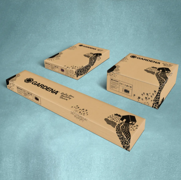
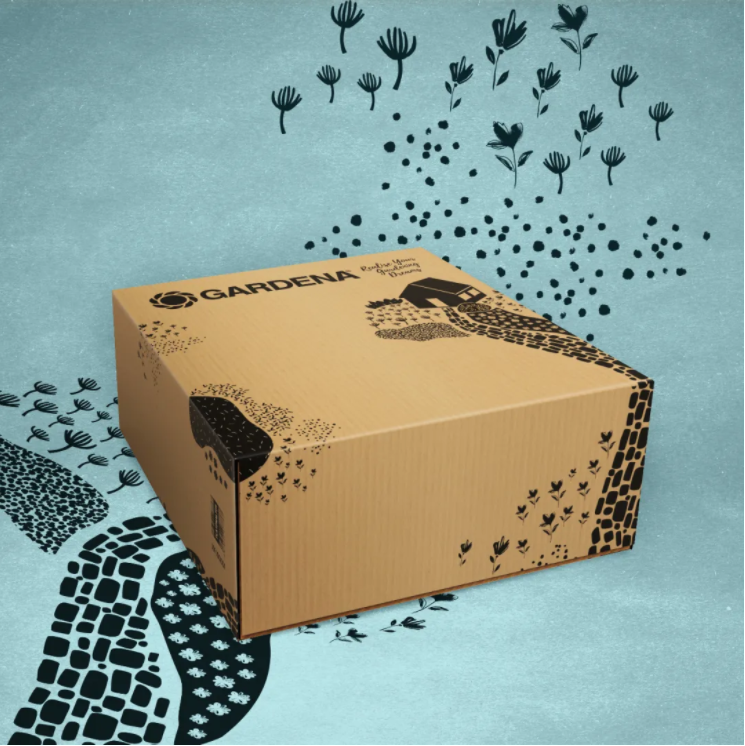
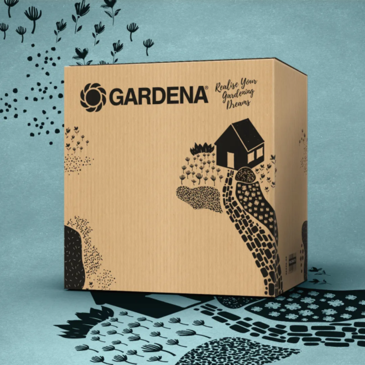
Gardena's new packaging has been designed to meet the needs of e-commerce transportation with the motto "simple and effective". As a manufacturer of gardening tools, we rely on cardboard to create romantic images of nature on the packaging, simple and clear, reflecting the brand and its values, extending to the edge of the cardboard box without being obscured by shipping labels or packaging tape during use.
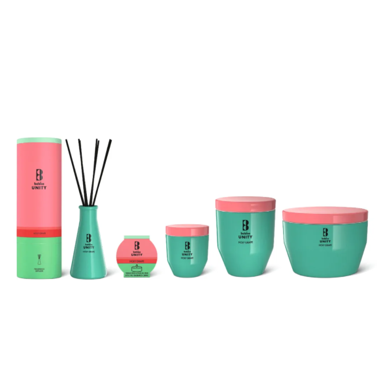
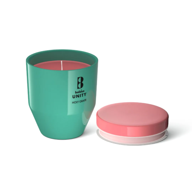
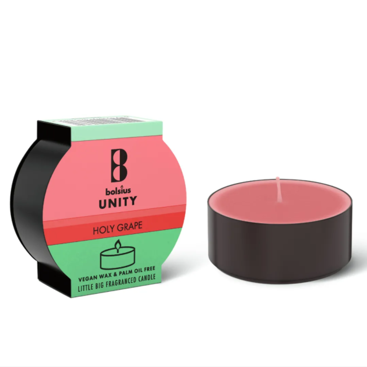
Bolsius Unity as a fragrance series product, USES the stained glass containers and cardboard packaging, this series of scented candles and no fire aromatherapy and consistent minimalist and elegant design style, the packing made of high quality and fully recyclable materials, clean elegant color design conveys the ingredients on the vision of the purity and the quality of the products.
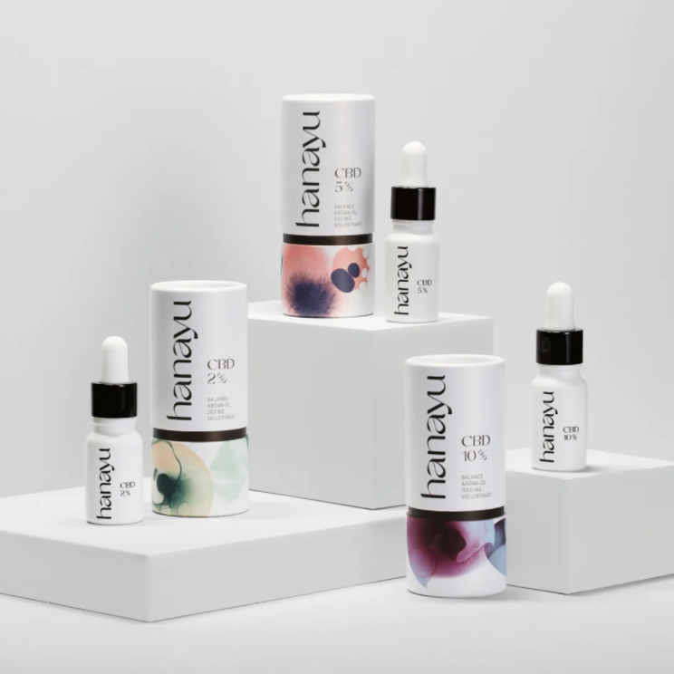
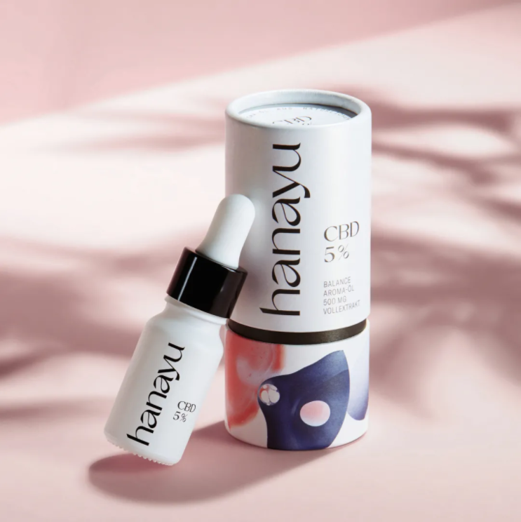
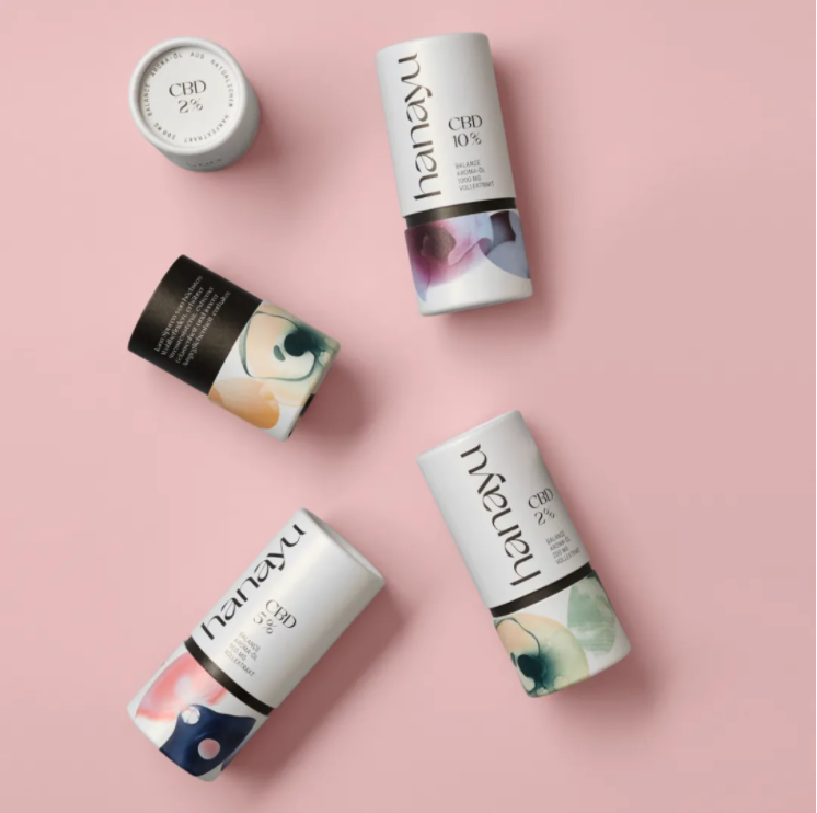
What makes Hanayu's appearance stand out is its unusual curved typography and elegant blend of colors in graphics, conveying a product that hopes to represent more balance and wellness in everyday life. On the vials inside the package, a minimalist black and white design dominates, effectively communicating the quality and purity of the ingredients.
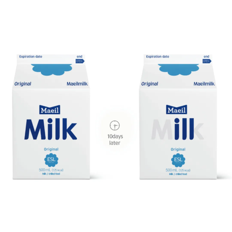
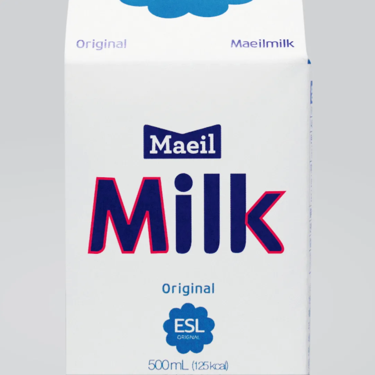
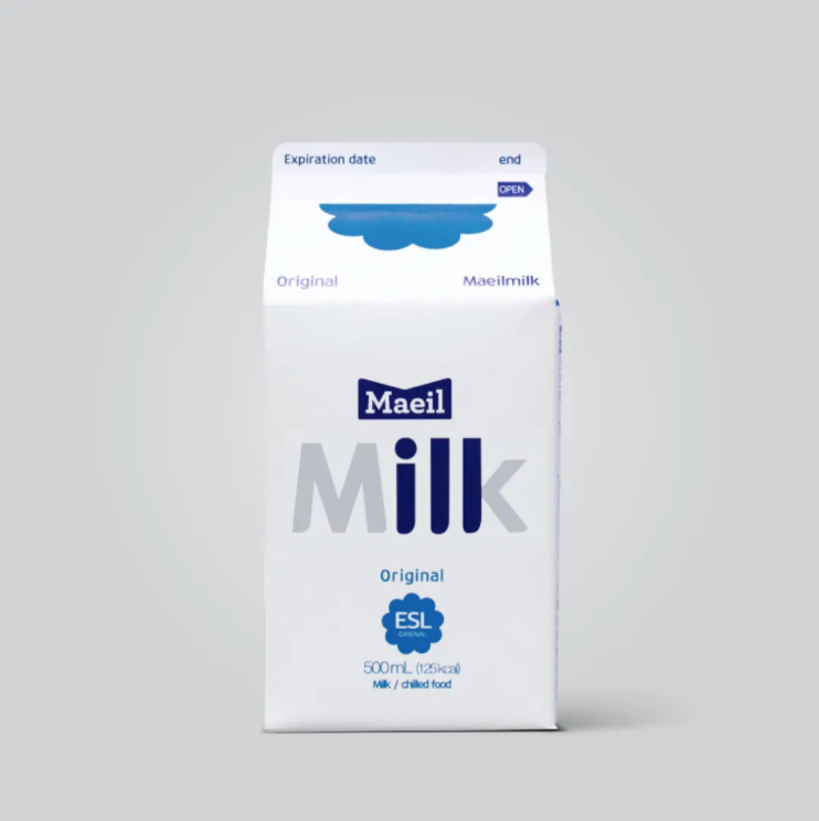
University: Dongseo University, Busan, South Korea Design: Yeongjun Lee, Seoyoung Lee, Eunbyeol Ha, Dongha Jo, Junhyeok Park, Dongseo University
Every year, millions of children suffer from diarrhoea and abdominal pain as a result of food poisoning, according to WHO. Tragically, 96,000 of these children died because they drank milk by mistake or were unable to tell when it had gone bad. The smart milk packaging is designed to take advantage of the time factor that causes dairy products to go bad and turn it into a visual indicator. In a matter of days, the word "Milk "was changed to" ILL, "a feature that successfully helped children recognize that Milk had gone bad, even if they couldn't read.